We live in a fascinating world of bold colors, some even producing psychological effects, and capturing our visual interest. Color psychology plays a crucial role in choosing window treatments, and what color scheme to choose for the rooms in your house. Here is a brief overview.
What is Color Psychology?

Color psychology studies how different colors can significantly influence our moods, and how to use it to trigger the desired common emotional responses. It’s no secret that various color associations affect our moods and behaviors. In fact, businesses use it in advertising as a contributing factor in their manipulation techniques.
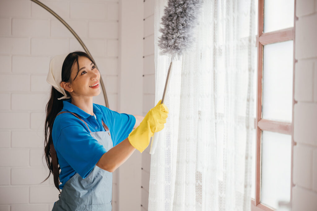
Creativity in Window Treatments
Finding the perfect window treatments can be a little daunting. Luckily, you can use color psychology when choosing window treatment colors, and create spaces with just the right atmosphere.
Besides personal style, there are a couple of other elements to consider. Home design involves crafting stylish and creative spaces, typically using a personalized color scheme.
Let’s take a closer look at the psychology of specific colors, and how to choose the perfect shades for an inviting atmosphere.
Color Types & Tips
Light colors and neutral colors like beige, white, and pastels, create a sense of overall well-being and openness. Warm colors are considered to be reds, oranges and yellows. Cool colors are hues of blues, greens, and purples.
Consider the room’s size. Lighter shades of cool colors can add depth to smaller rooms (like children’s rooms), making the space feel bigger. Dark colors create a more intimate atmosphere.
Additionally, consider the amount of natural light the room gets. In bright spaces with plenty of sunlight, you can use bolder, brighter colors. Rooms that are dark or dimly lit with little to no sunlight, light or pastel shades may help open it up.
The Meaning and Influence of Each Color
Red
In home interior design, red is said to represent energy and passion, and is good for social spaces, where it can stimulate appetite and conversation.
Orange
The color orange, and bright shades of other warm colors, make terrific accent colors, depending on your color scheme. Orange is a playful color that symbolizes creativity, hope, and excitement!
Yellow
Yellow is a cheerful color that is often used to promote positivity, happiness and optimism. Use yellow to bring warmth and brightness into your space.
Blue
For a tranquil atmosphere, deep blues as well as lighter shades promote relaxation and calmness. Blue is used to inspire stability and create a tranquil ambiance.
Green
Green is a revitalizing color symbolizing nature and harmony. This color is also said to promote relaxation and have a soothing effect.
Purple
The color purple symbolizes luxury, spirituality, and creativity. This color is used to add a touch of elegance and sophistication, as well as to promote tranquility.
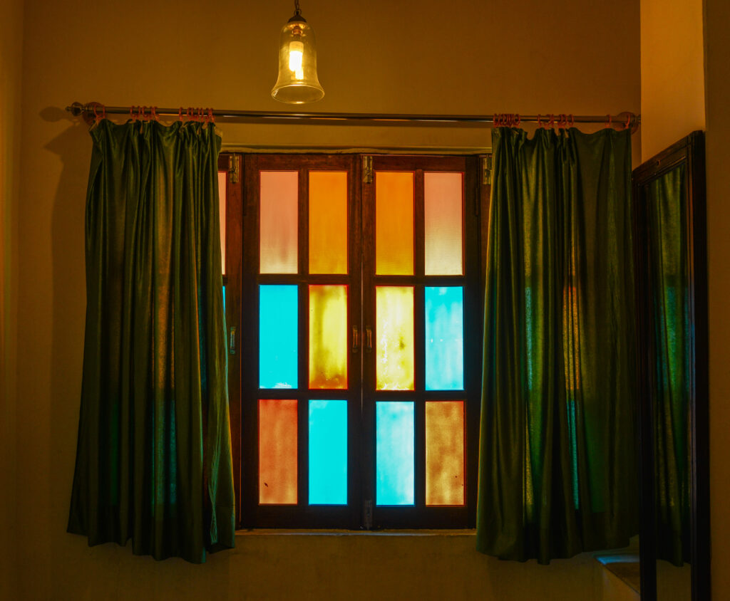
Window Treatment Design Tips

When designing your color theme for each room, you can match colors using a color wheel, and get custom window treatments in complementary colors to other decor elements. For example, if the room is primarily neutral shades, like whites and beiges, introduce color with window coverings that match your accent color.
Additionally, consider the function of the room you’re decorating. This will help guide you to an appropriate color. Let’s look at some examples of colors for different spaces, and how to accentuate with varying window treatments.
Room-By-Room Window Treatment Inspirations
Living Rooms
Living rooms are social areas, where we encourage conversation and entertain guests. Many people have neutral colors and at least one accent color in their theme.
Why not try red window treatments to liven up the space? Smart Blinds or curtains & drapes – or both, as many people prefer – are perfect for living room window treatments.
Add warmth and spark conversation in living rooms with warm colors like red, orange, or yellow. Remember, it’s OK to mix colors in window treatments. Don’t be afraid to customize every room with a different window treatment and color!
Kitchens & Dining Rooms
Colors and window treatments for kitchens are often white and yellow or orange, which creates a happy and vibrant environment for cooking and cleaning. Window treatments can also be matched to any color. However, white or wood blinds and shutters also work well in kitchens.
Formal dining rooms may be a good spot for dual window treatments, to add a touch of elegance to the room. For example, motorized roller blinds are trending (“smart blinds”) and make a great window treatment. Curtains are also popular window treatments, especially in these areas.
Bedrooms
In bedrooms might be a spot to try purple window treatments. Purple is really a versatile color, and can help design a unique and inviting space. Blue is another color that’s ideal for either bedrooms or window treatments. Shutters are another popular window treatment for bedrooms.
Home Offices
For home offices, try green window treatments to help foster a serene environment. This space should be conducive to productivity, and shades of green are perfect.
If you use green for the room, wood or faux wood blinds or shutters make the ideal window treatment. This combination gives the space a “connected with nature” vibe, helping you stay grounded.
Meet Arizona Blinds Company
At Arizona Blinds Company, we have every kind of window treatment you could possibly want! Plus, we do custom window treatments and window treatment repairs.

We love Arizona’s homeowners and business owners, and can provide window treatments for residential or commercial settings. All you have to do is schedule a free consultation, and our representatives come to your location. We look forward to helping you create the look of your dreams.